Du Cane
Visual Identity
Verbal Identity
Packaging
Signage
Art Direction
How do you grow from a nanobrewery without losing your Tassie roots? To introduce Du Cane to the world without bringing too much of the world into Du Cane? To not reveal Tassie secrets, but share enough Tassie secrets to be interesting? To be on the taps of a few Launnie pubs to being on the taps of just a few more Launnie pubs? Our challenge was to grow Du Cane without appearing to grow Du Cane, and keep the brewery staunchly localised — whilst inviting outsiders in.
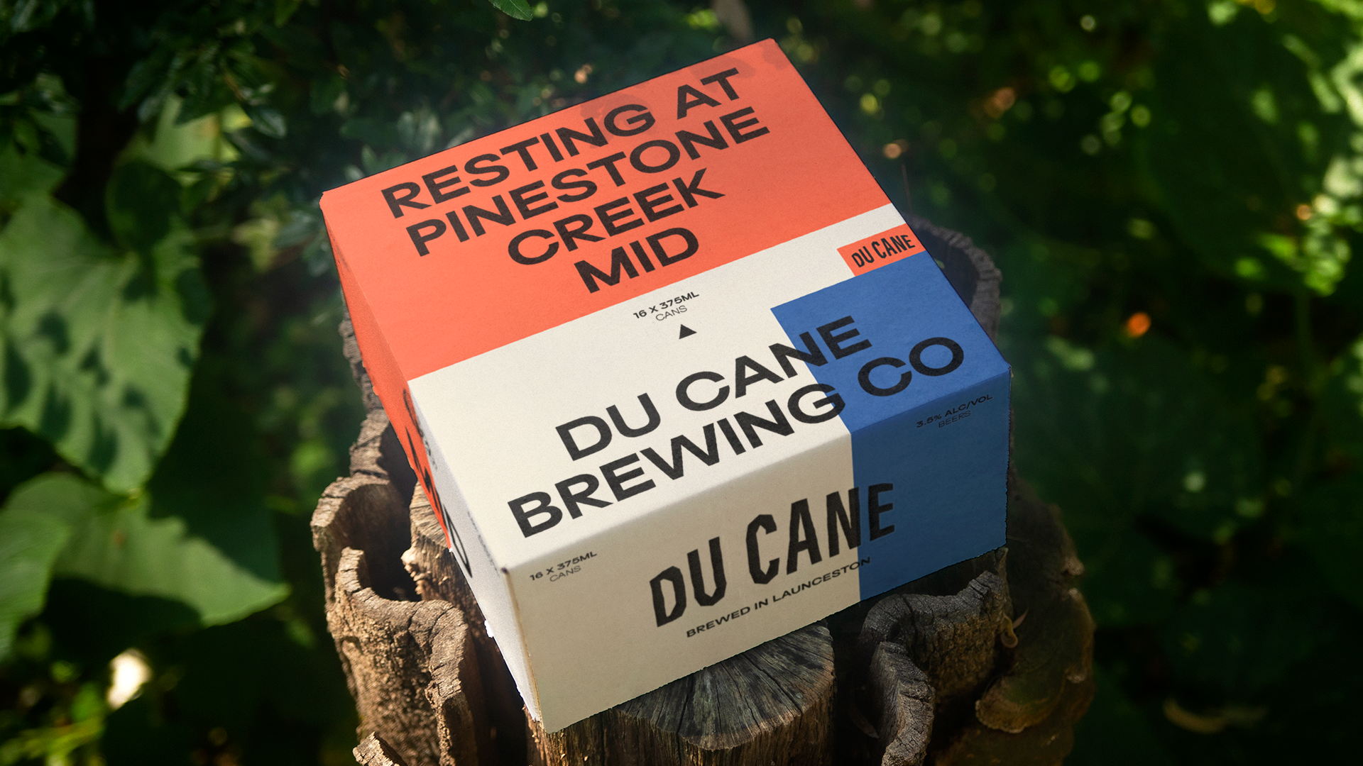
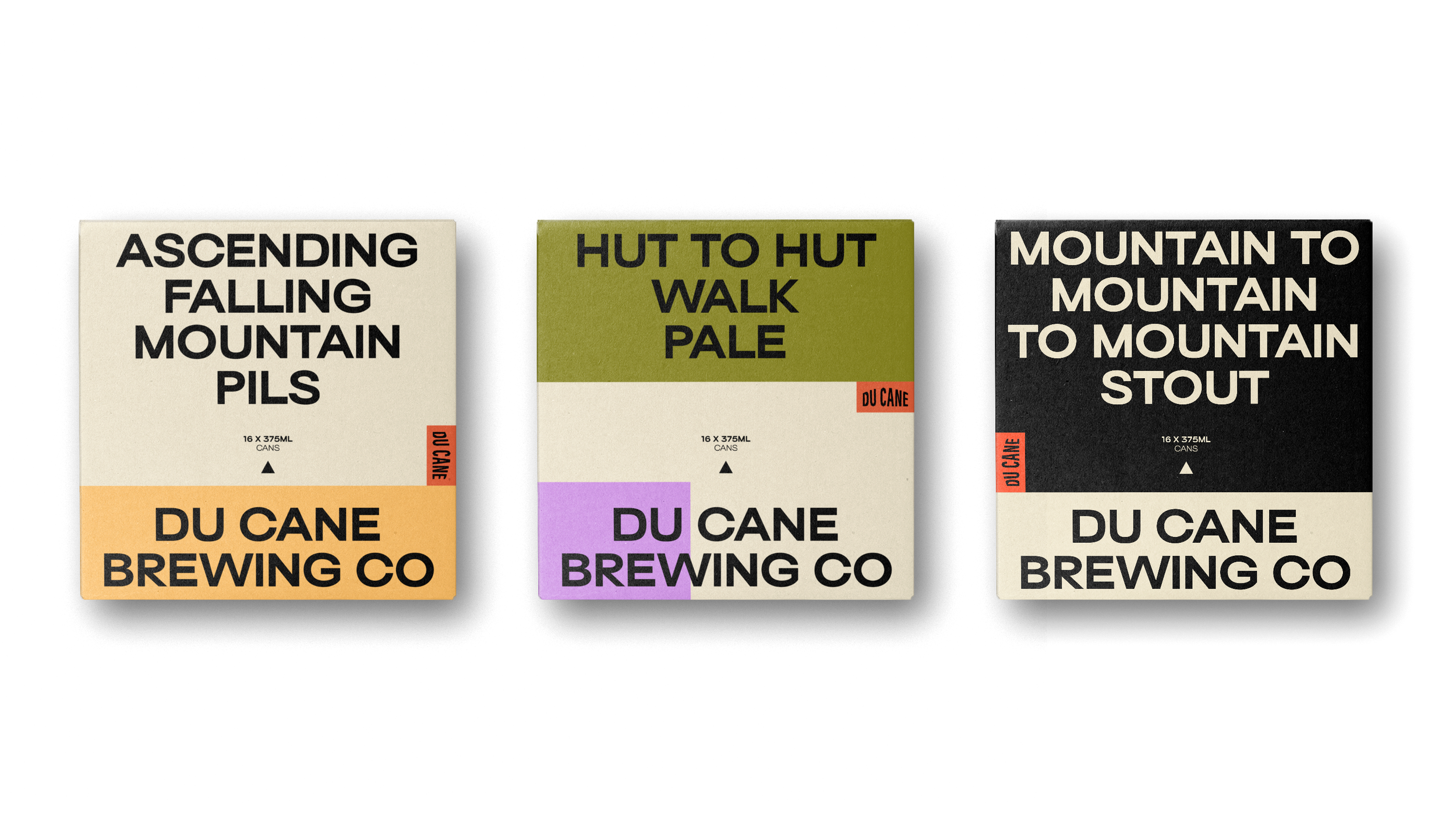
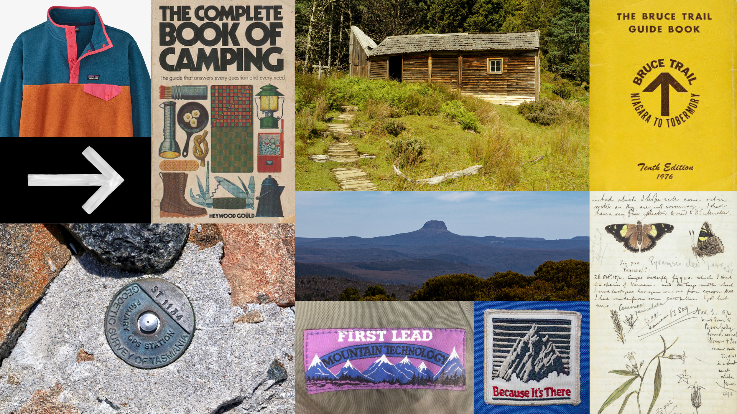
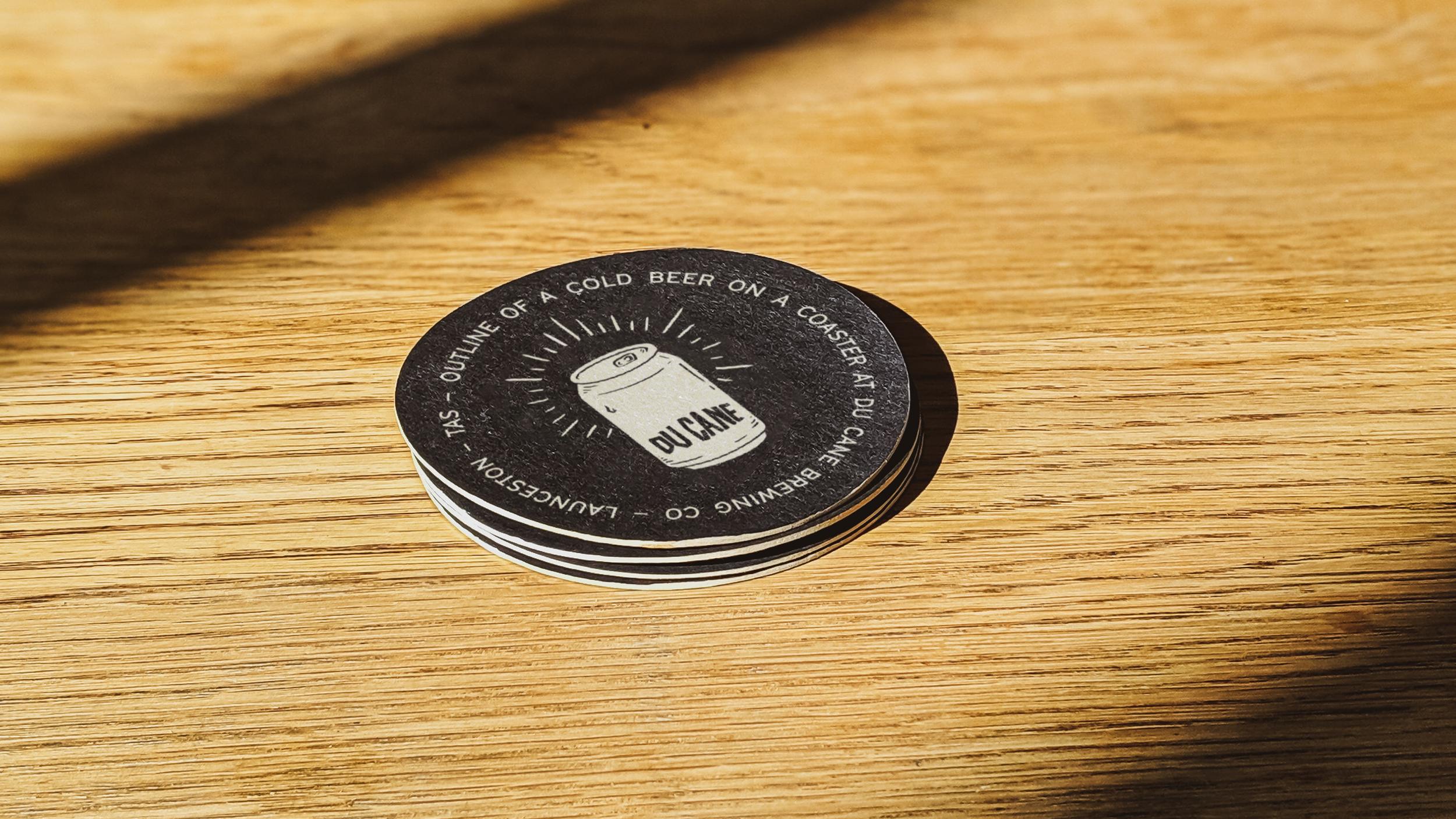
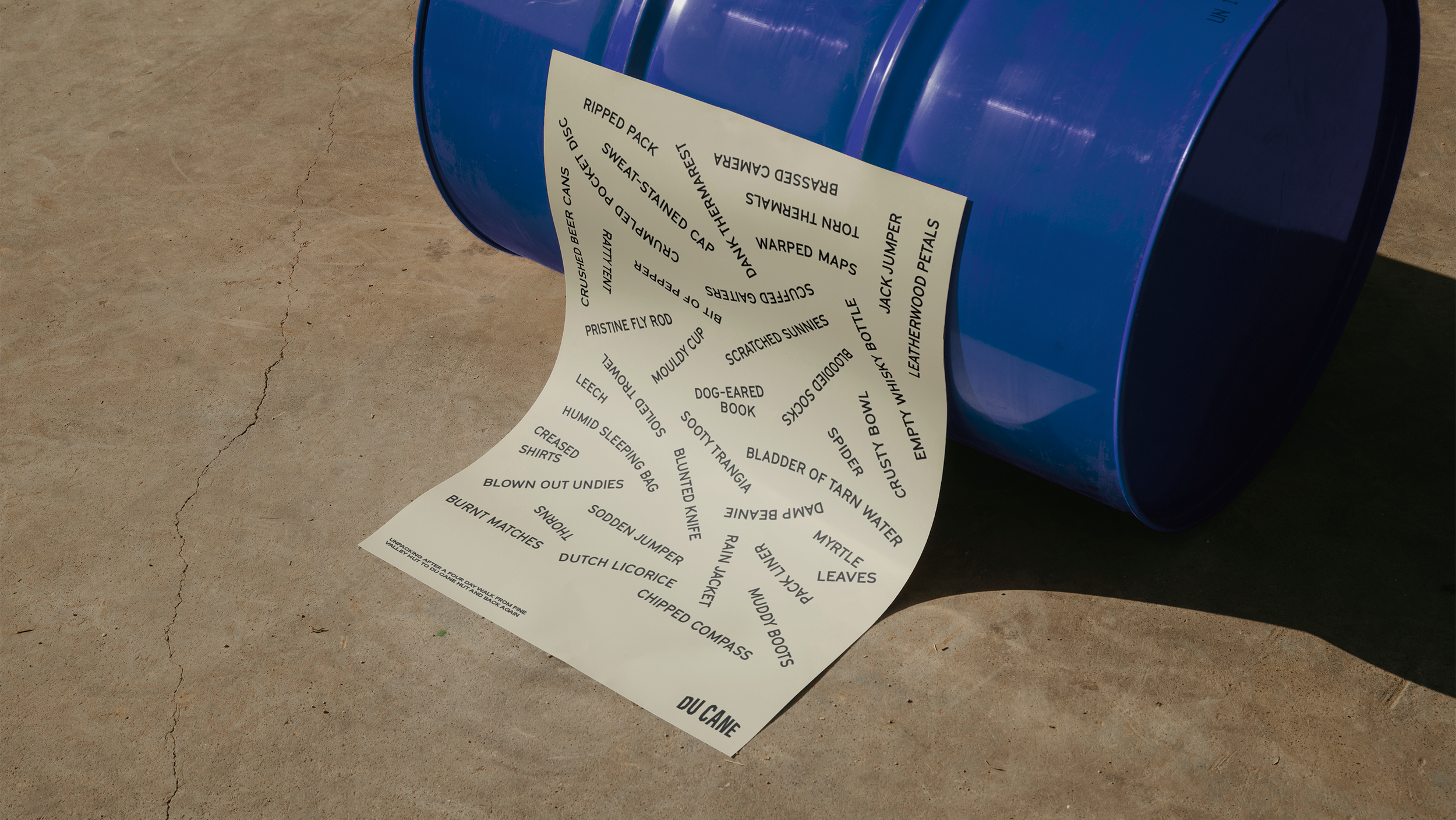
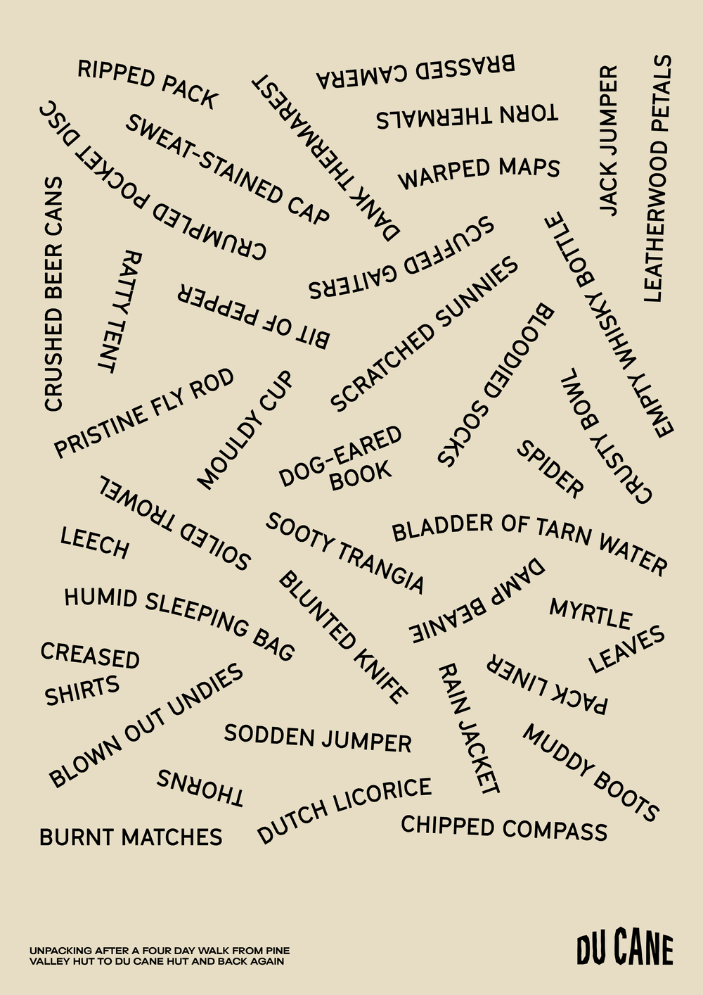
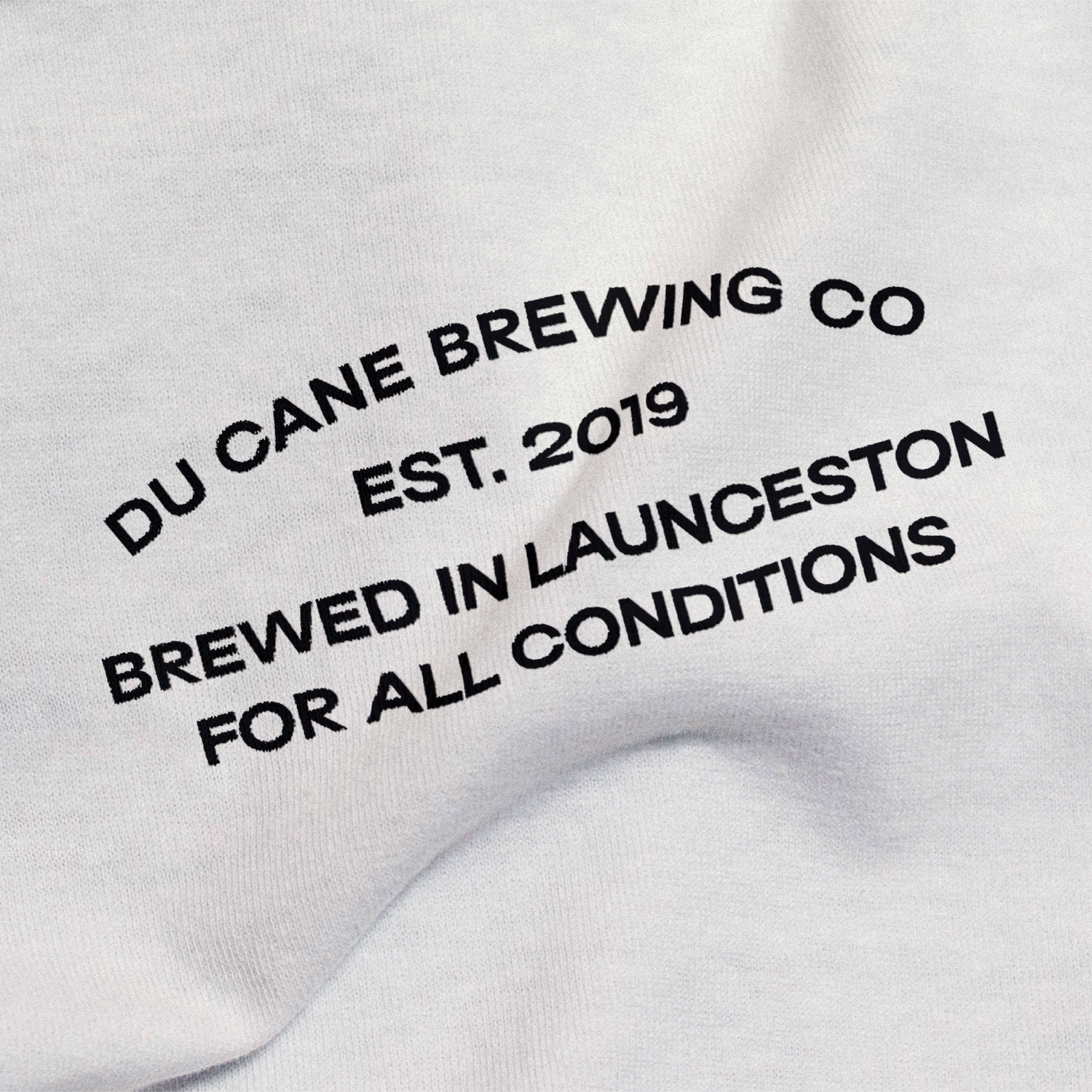
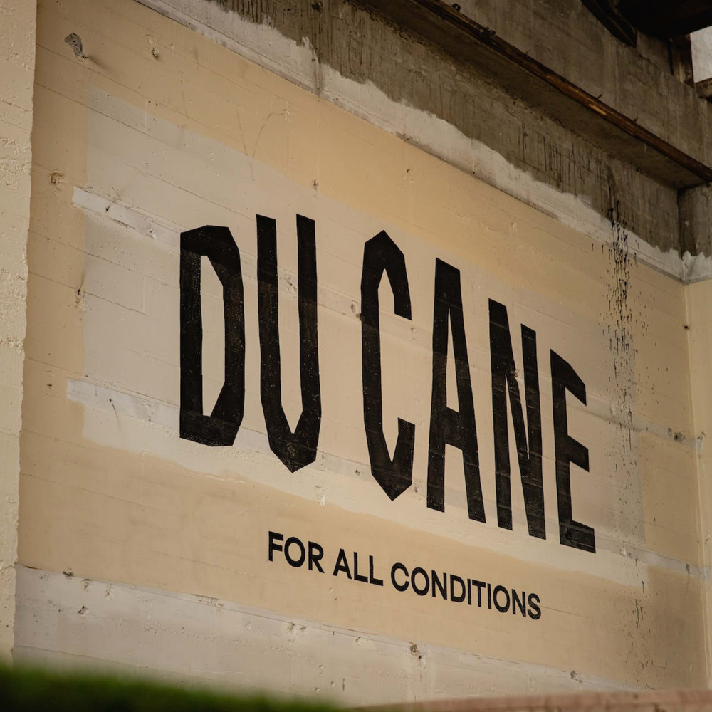
We created an identity that was inspired by the Ranges and local guide/walking culture, inviting the drinker into the world of Du Cane. This identity is designed to capture and pay tribute to the unique geography and moments experienced on and off the Du Cane trails.
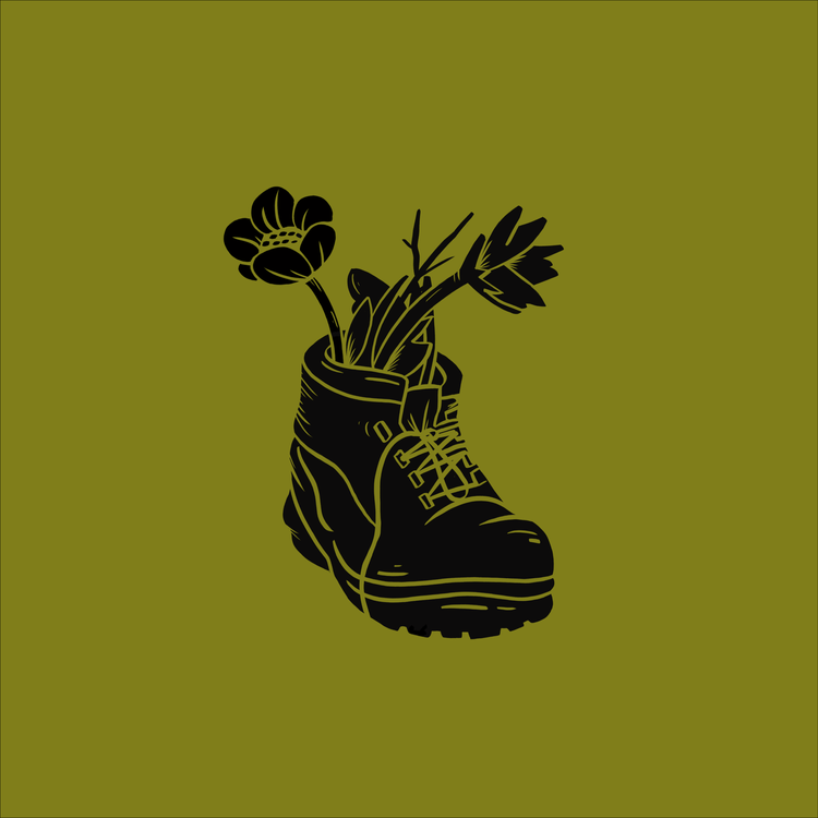
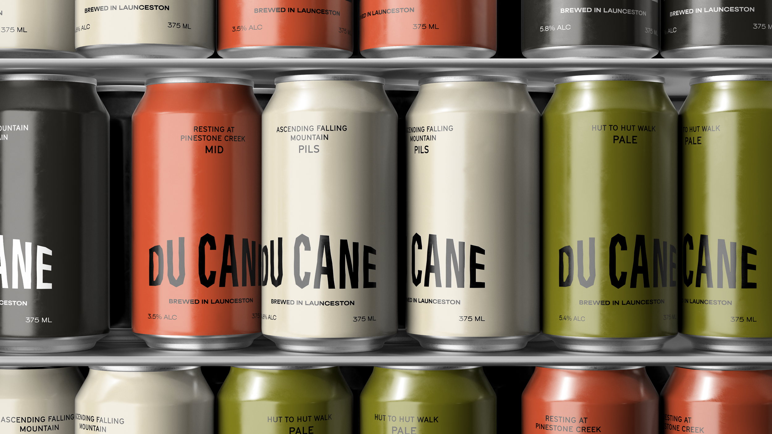
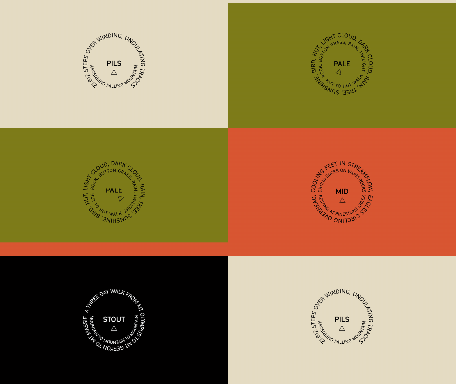
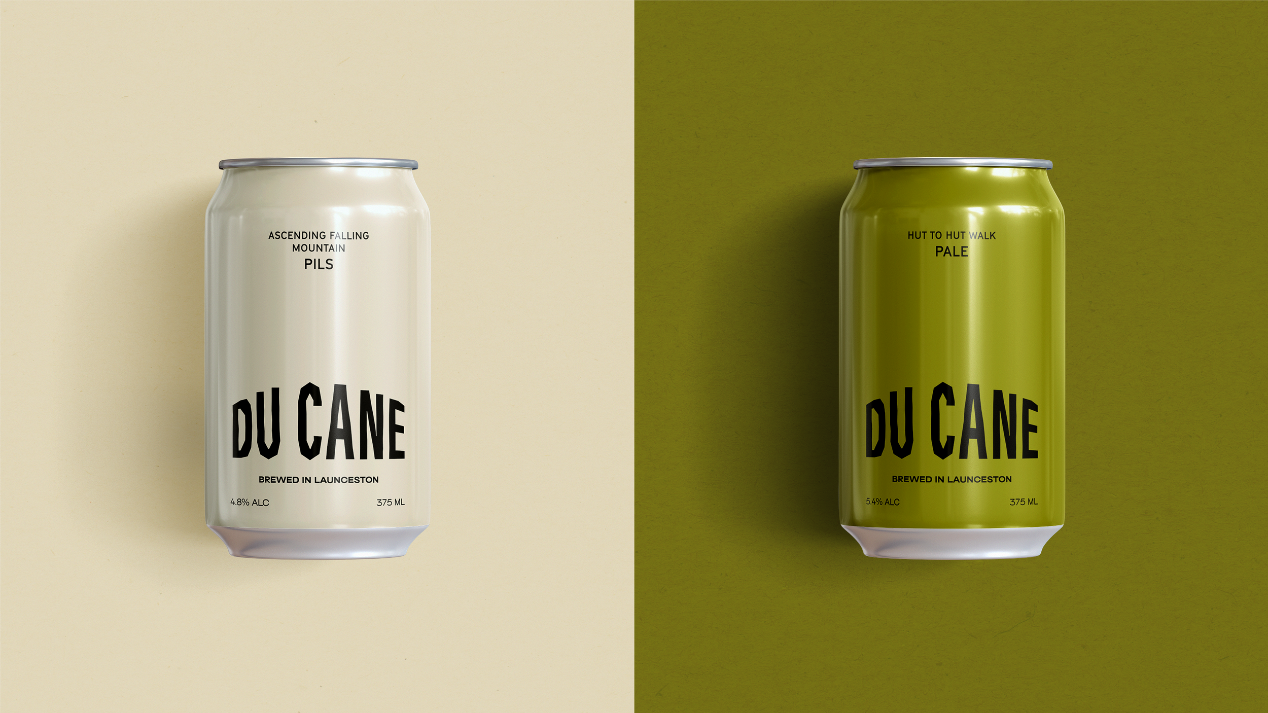
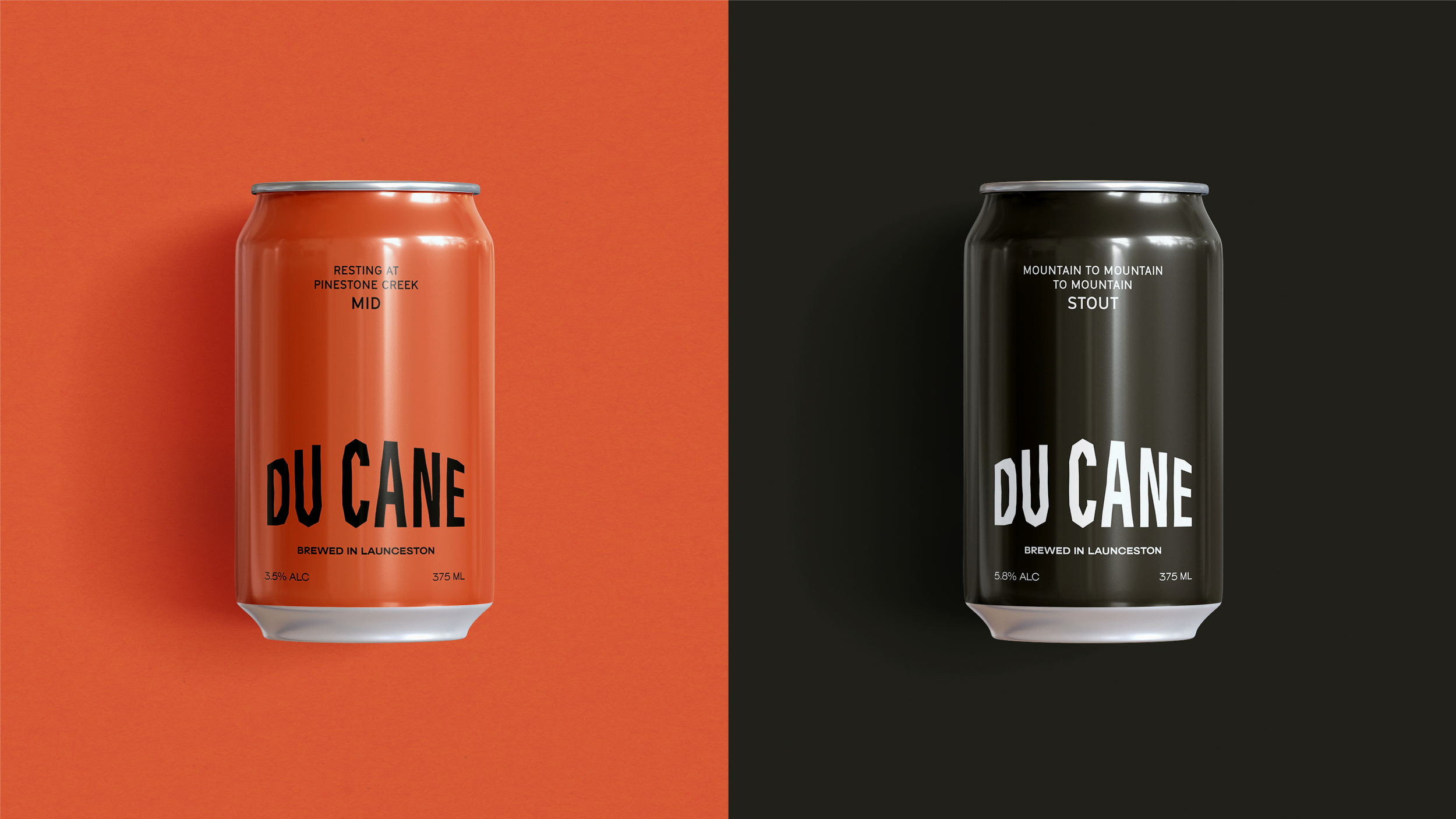
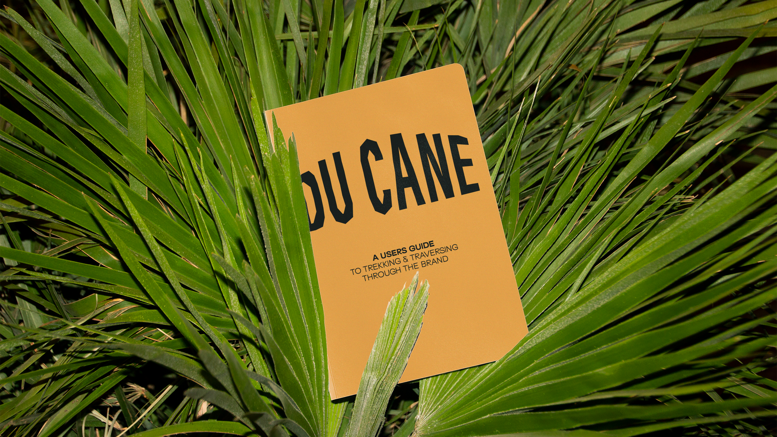
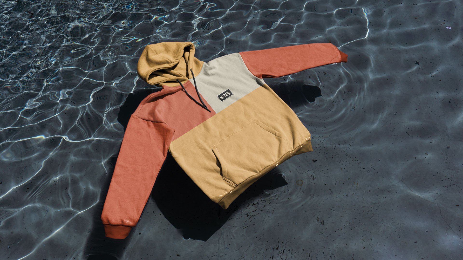
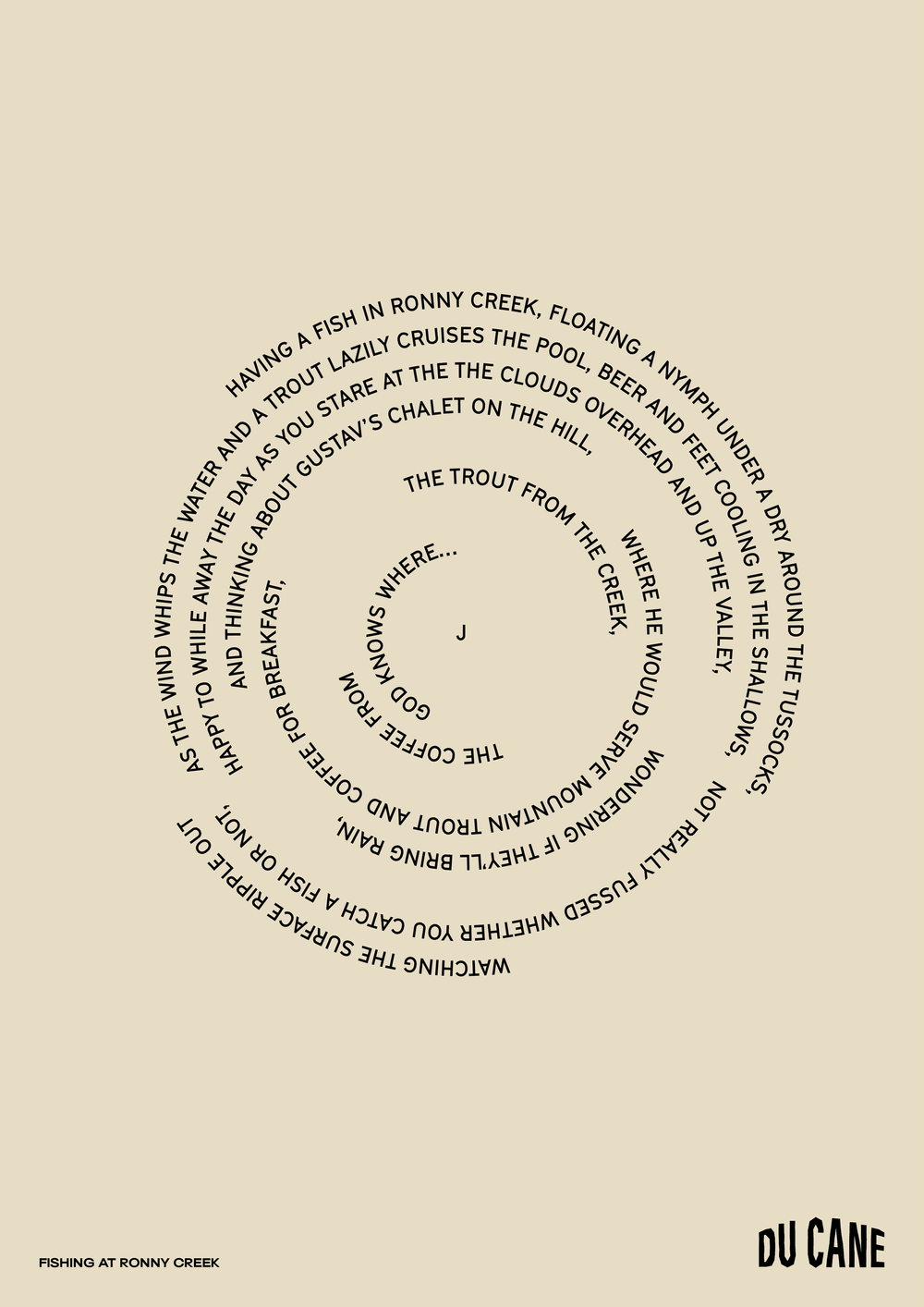
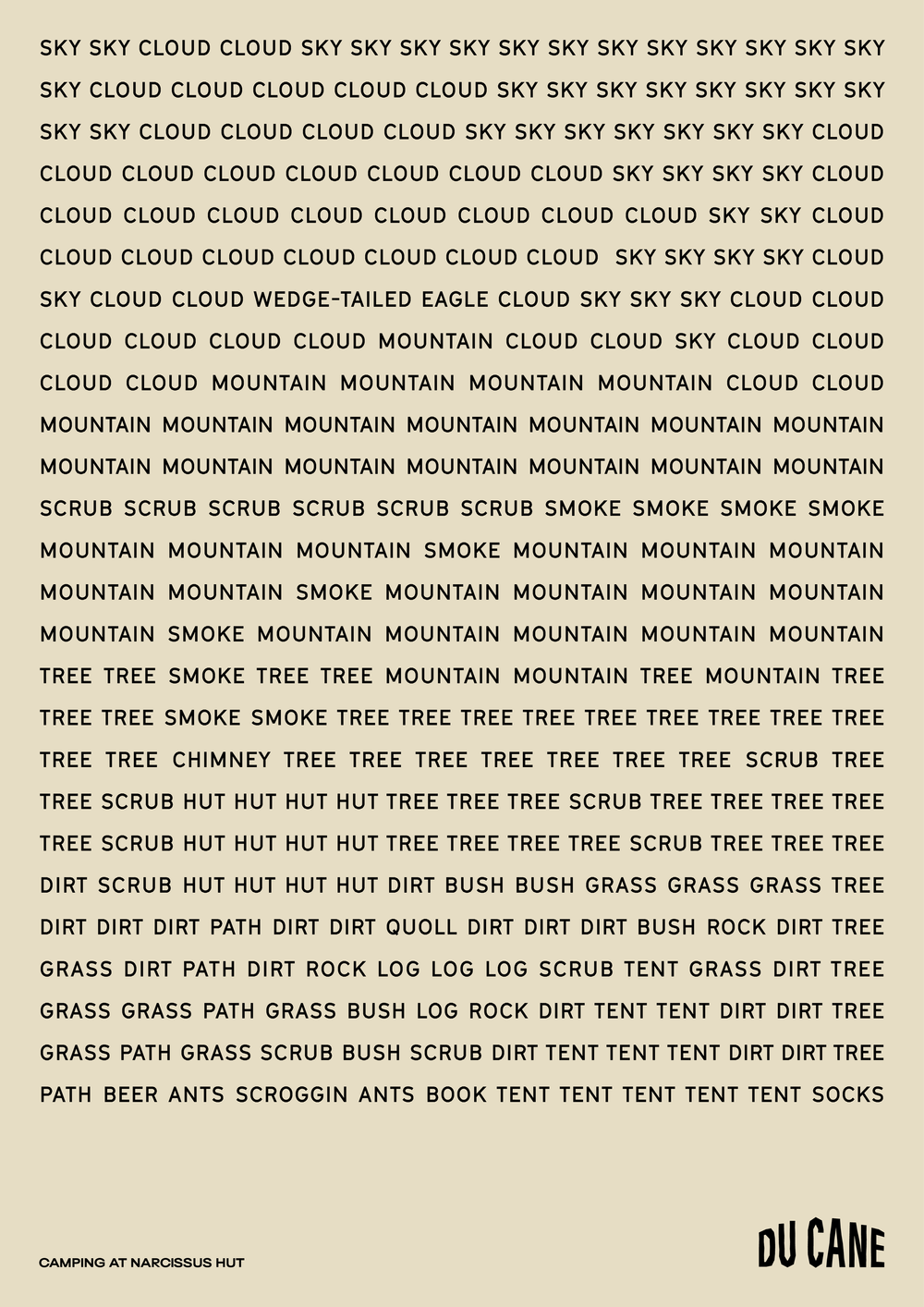
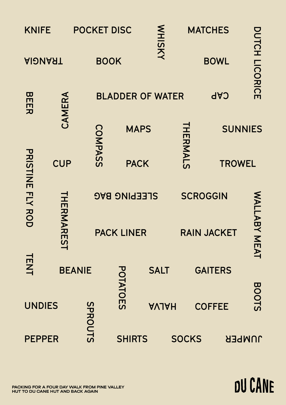
Paying homage to some of our favourite nature artists, guide culture, and the outdoors, we aim to project the drinker into the world of Du Cane — as if they were there experiencing it for themselves. The logotype embodies a mountain range; varietal lockups are inspired by trig points; colours reflect the environment and vintage guide clothing; illustrations are journal sketches of landmarks; and language pays homage to environmental artists, guide etiquette, and the tangible moments experienced along the journey.
Collaborators
Designers
— Georgia Urie
— Dash O’Brien-Georgeson
Writer
— Daniel St Vincent
Account Management
— Alice Marrows
— Monique Tadrous
Illustrators
— Sam Lyne
— Dash O’Brien-Georgeson
3D Render Animation
— Andres Mauricio
Photographers
— Will Horan
— Du Cane Brewing Co
Recognition
Transform Awards
— Gold
— Bronze
AGDA
— Pinnacle
— 2x Merit
