Humphreys Real Estate
Visual Identity
Verbal Identity
Signage
Toolkit
Guidelines
Brand Applications
Humphreys is something of a revolution —a genuine local real estate agency with a significant national reach. For so long we’ve all accepted the same old clichés. The jargon. The sales-shtick. The agent as king. But that’s not how Humphrey's saw things
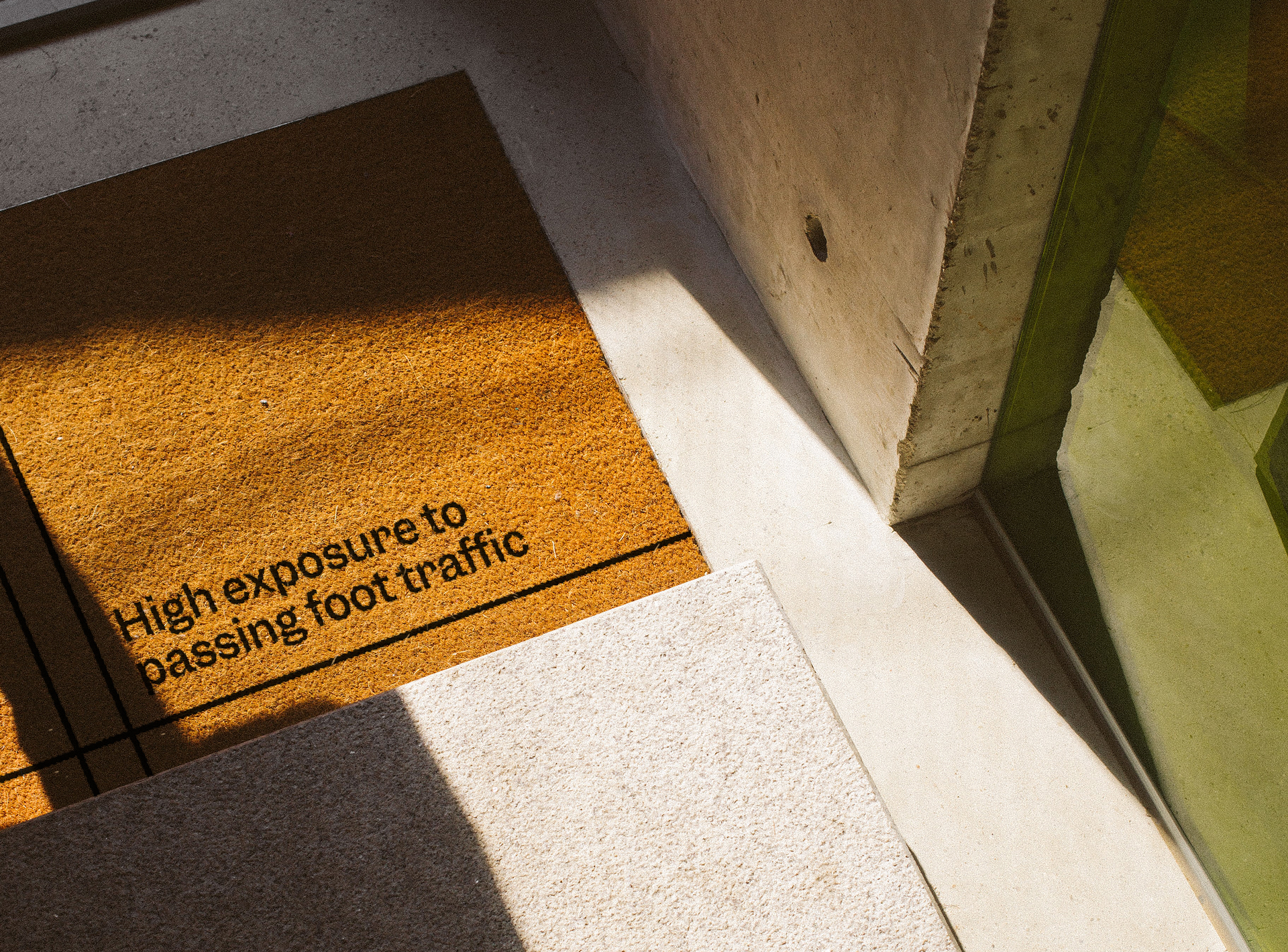
What sets them apart is their hyper-localness: championing the people and the places that make up the community — and making them an integral part of the agency. Their service is founded upon an astute knowledge of the market, and a determination to navigate and negotiate the best possible outcomes in what can occasionally be complex matters.
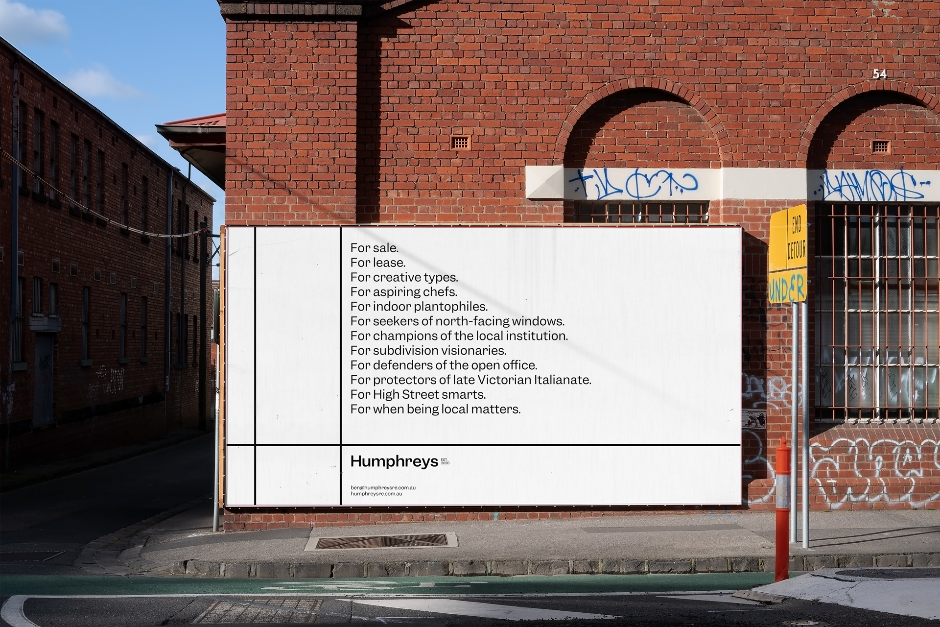
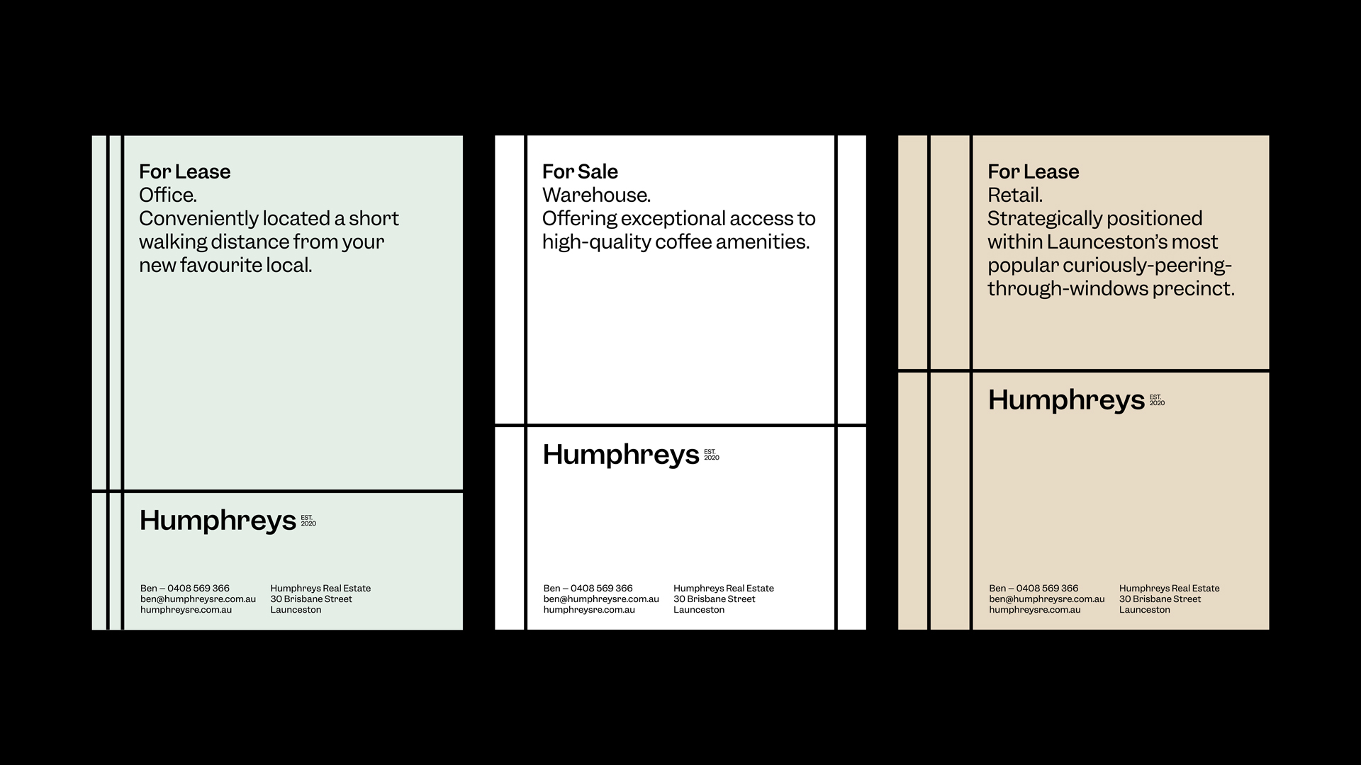
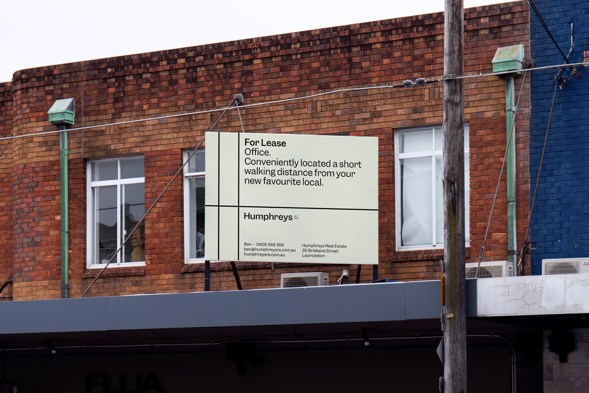
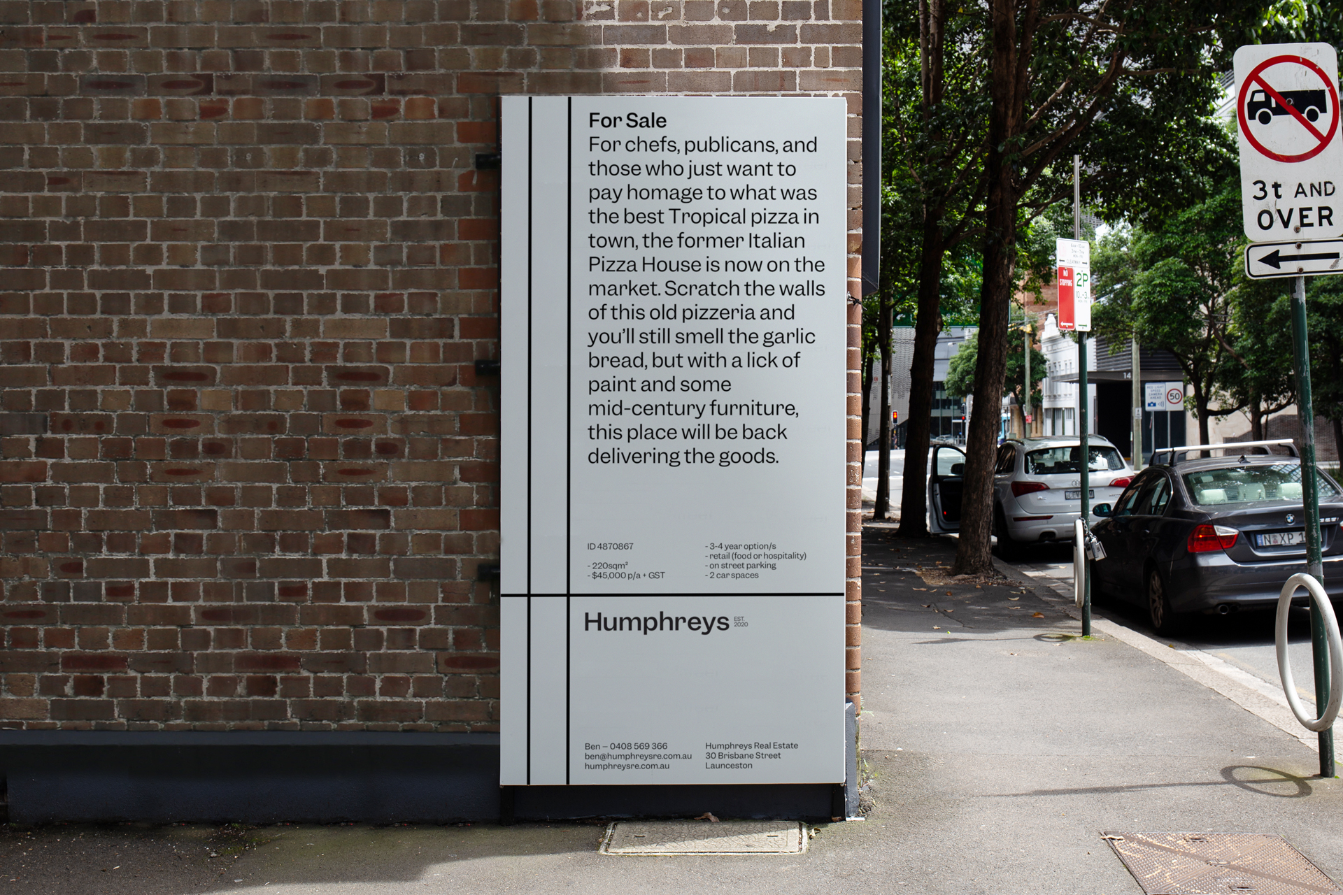
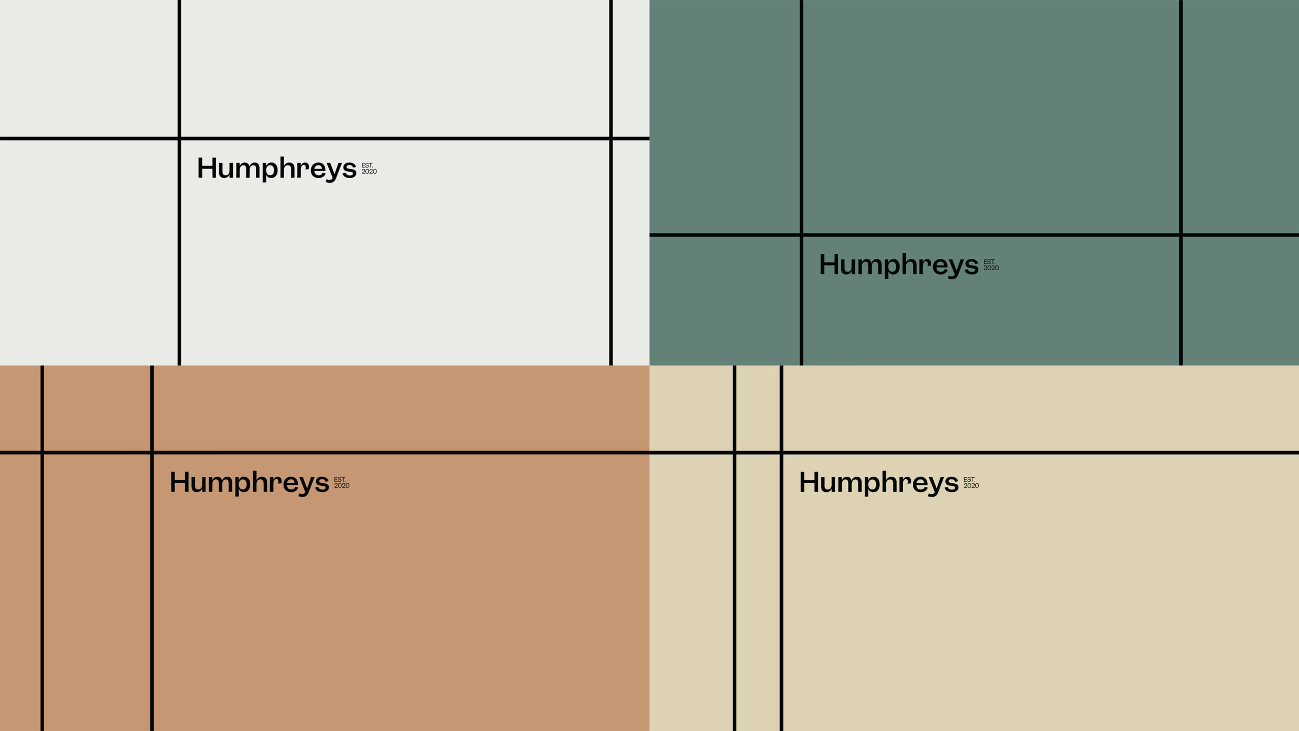
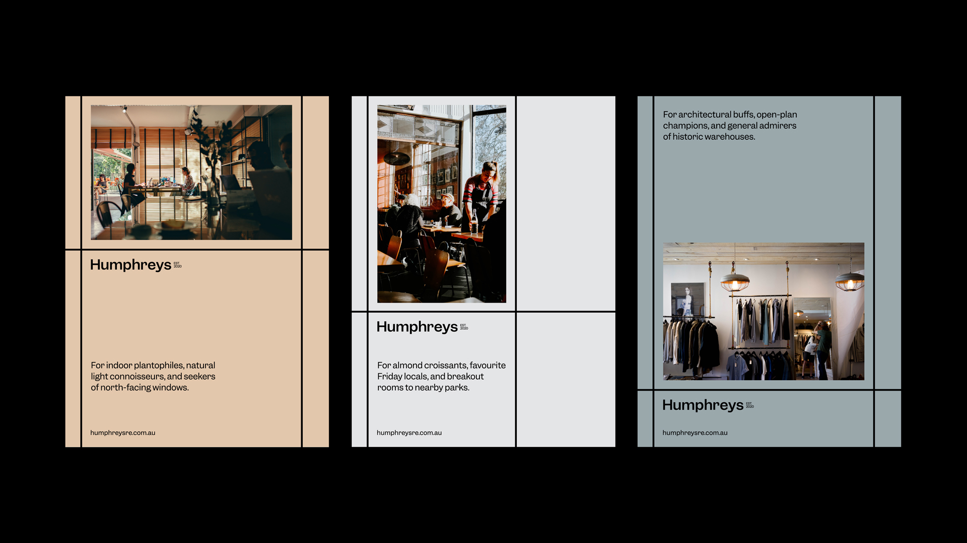
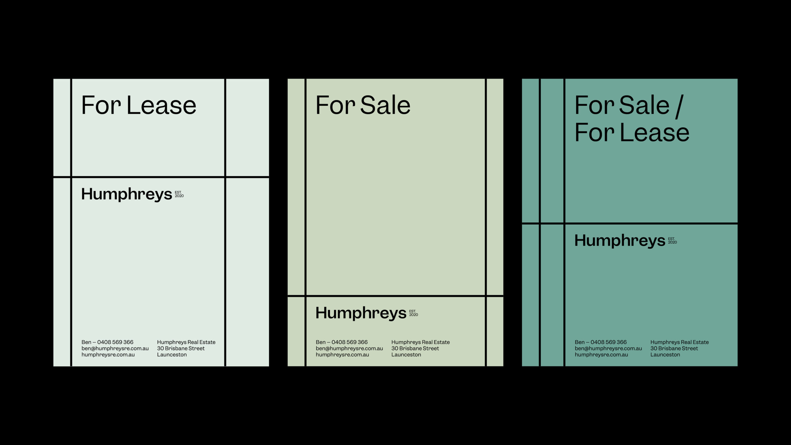
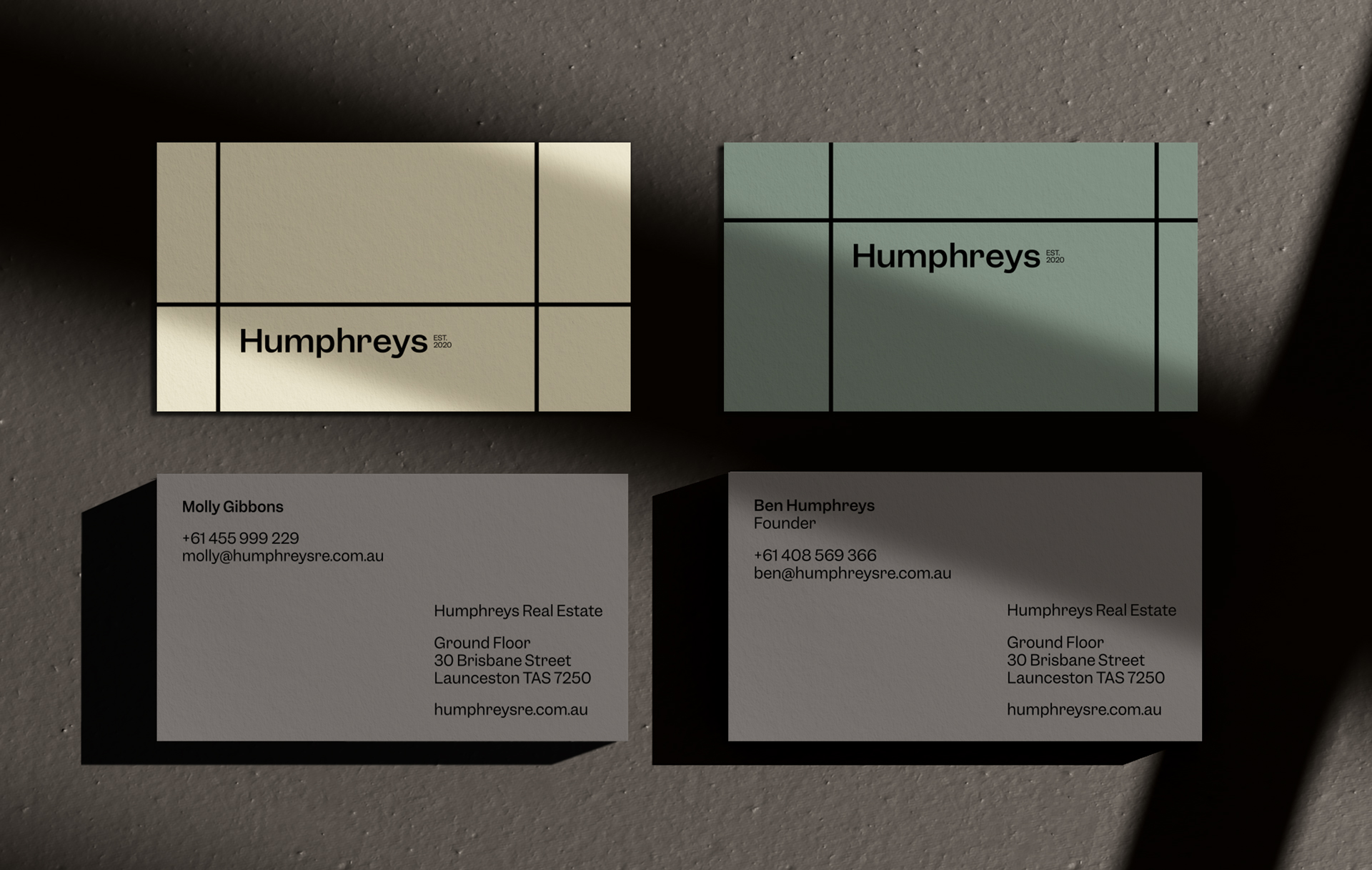
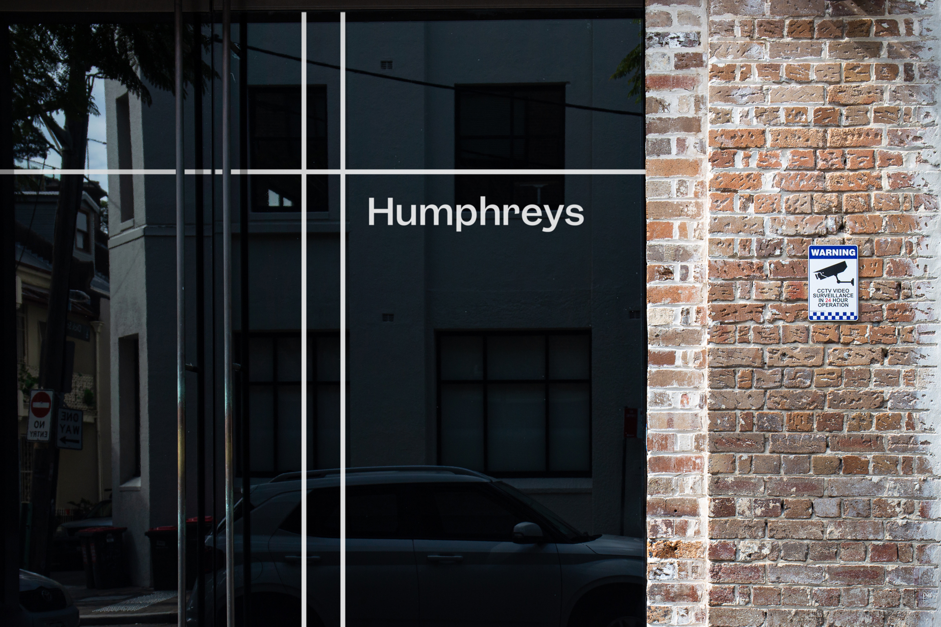
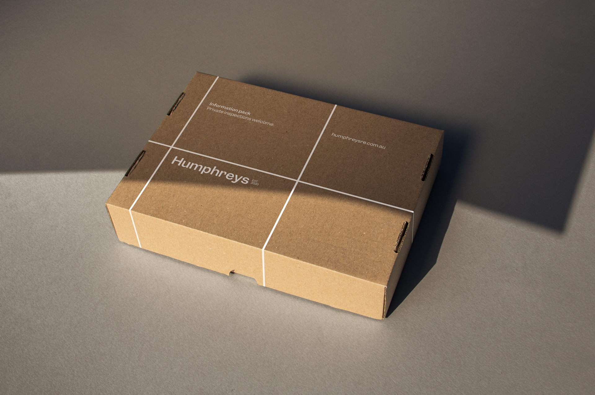
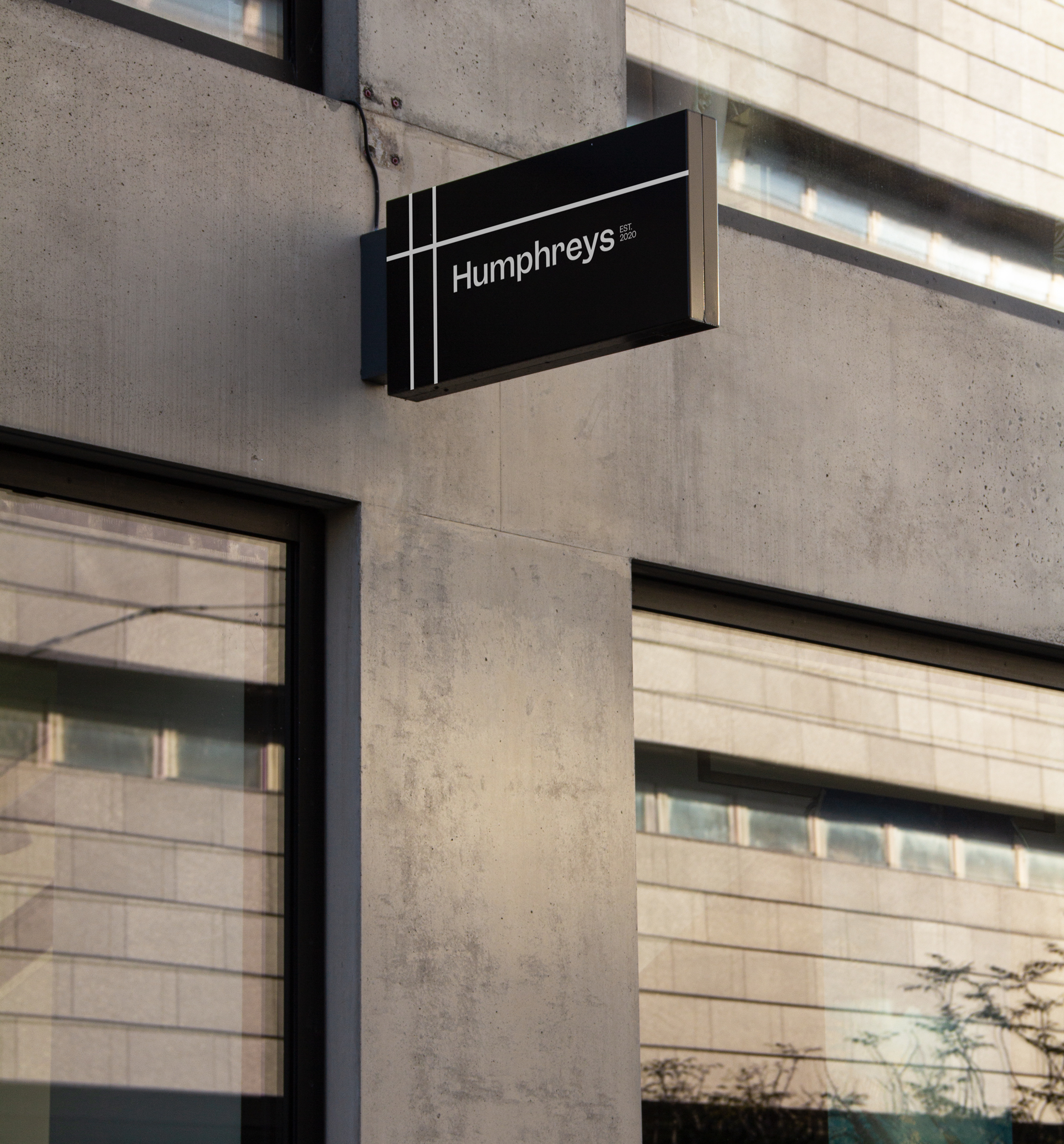
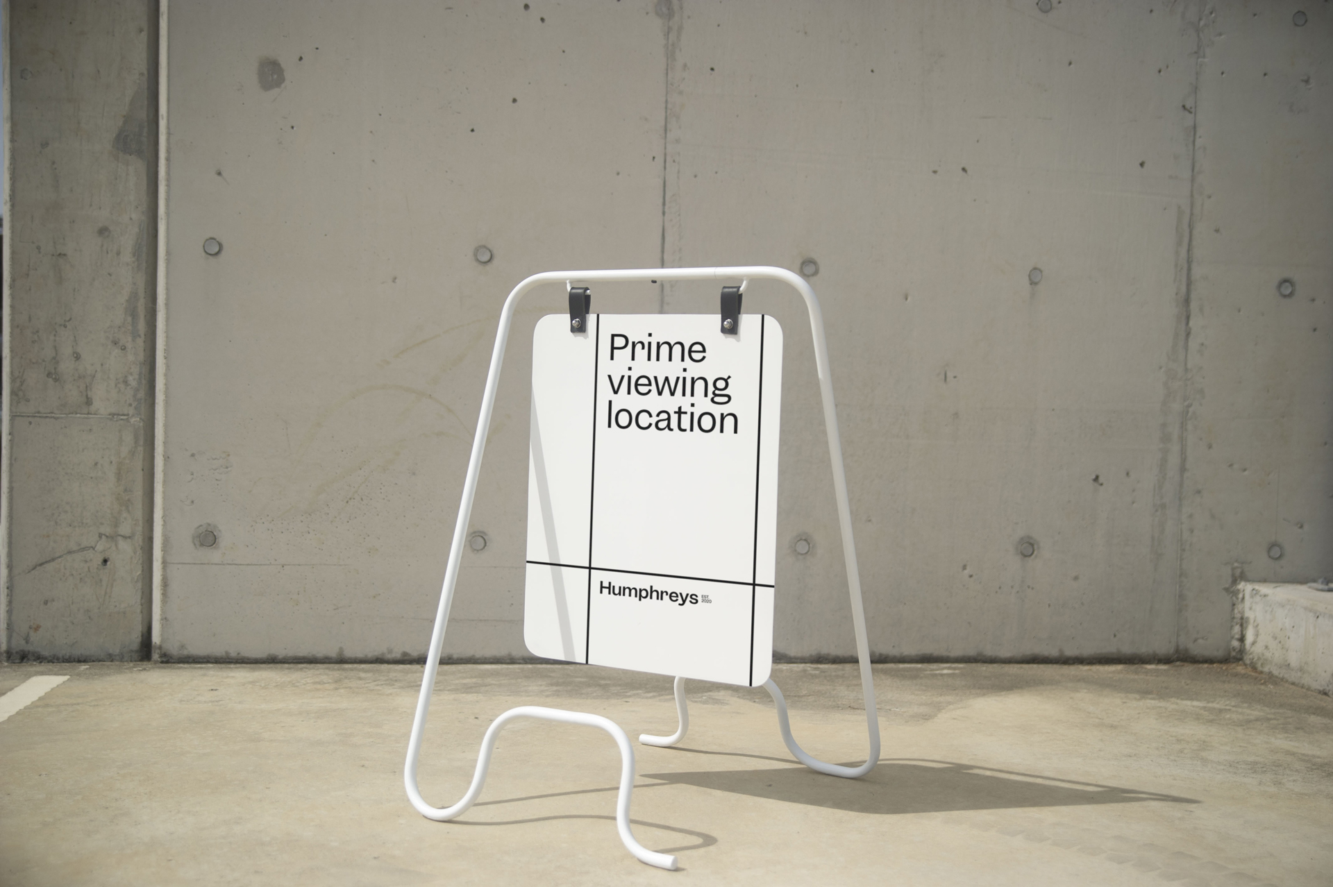
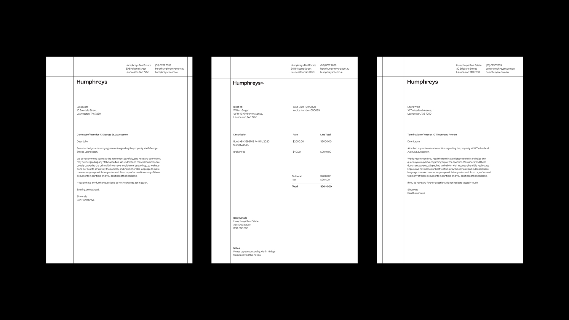
The new identity is inspired by the local neighbourhood, championing the people and places that make up the community. The logo is shaped by the intersection of streets within the map of Launceston, where they were founded; the identity promotes a progressive approach to real-estate; the language is hyper-local and plays with real estate patois, yet is broad and interchangeable for the team to implement wioth ease.
Collaborators
Design Director
— Olivia King
Designers
— Georgia Urie
— Dash O’Brien-Georgeson
— Kimberly Luo
— Pete Conforto
Writer
— Daniel St Vincent
Account Management
— Alice Marrows
Recognition
D&AD
— 2x Shortlisted
AGDA
— 3x Merit


