Ball & Doggett
Brand Strategy
Brand Architecture
Visual Identity
Graphic System
Brand Applications
Brand Toolkit
Guidelines
Motion
Production
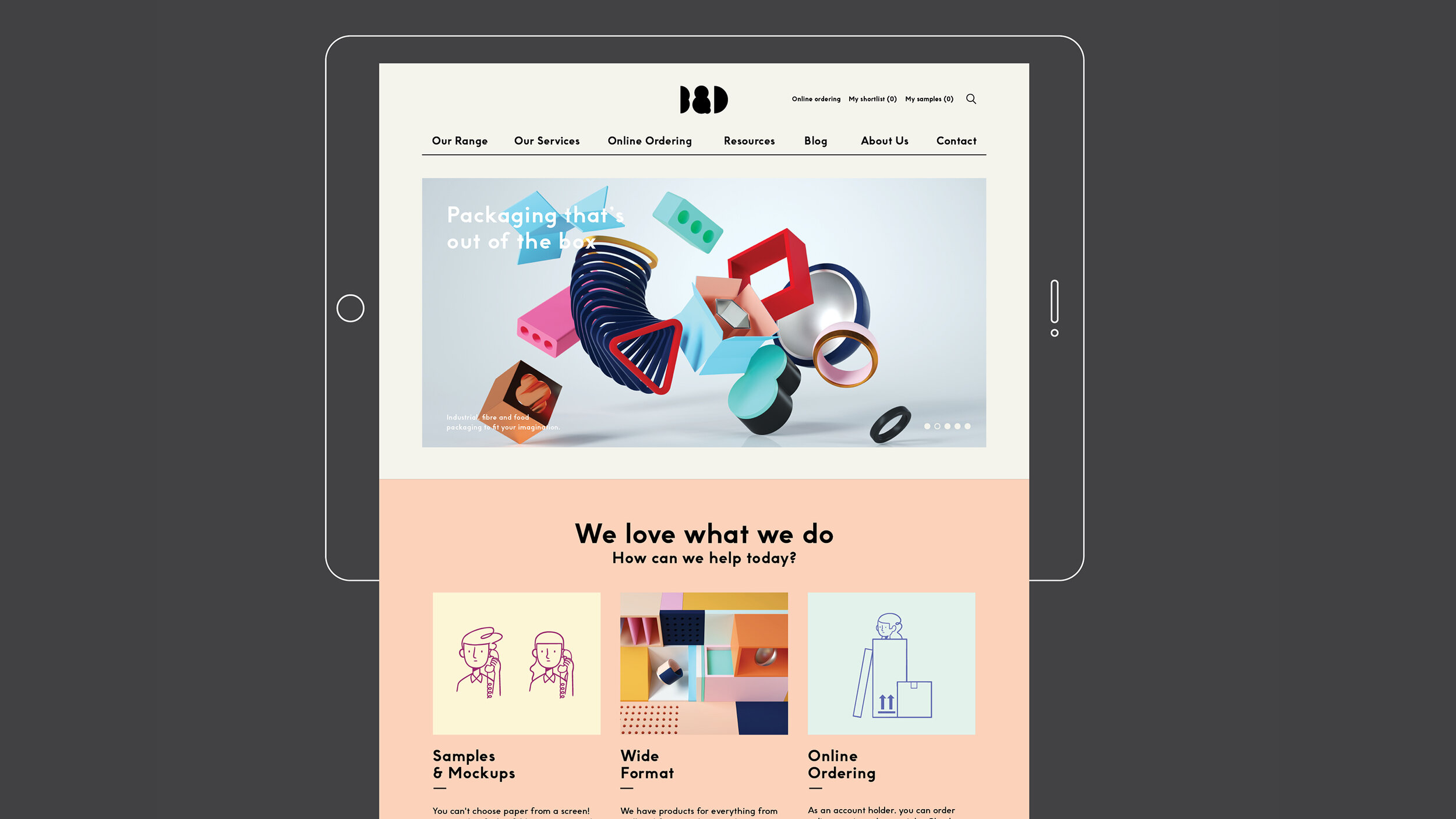
In early 2017, B.J.Ball and K.W.Doggett joined forces to become Ball & Doggett, the largest paper distributor in Australia and New Zealand. The merger was as an opportunity to build a new identity that better reflected the true nature of the business – that of a highly diversified, innovative company that supplies every material associated with the print and production supply chain – paper, packaging substrates, inks, foils, plastics and much more.
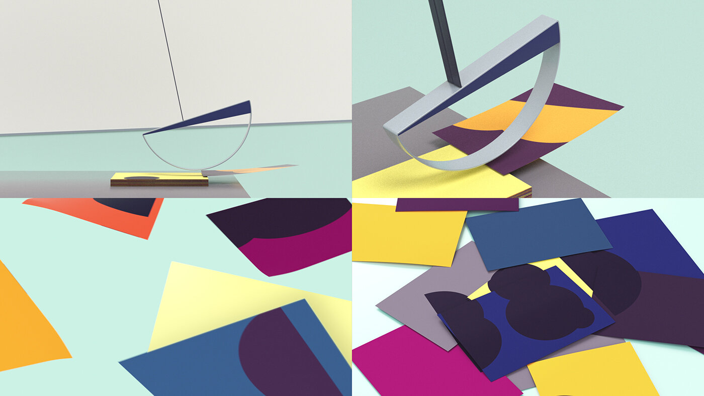
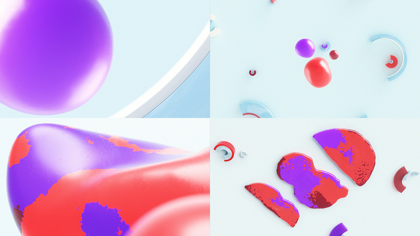
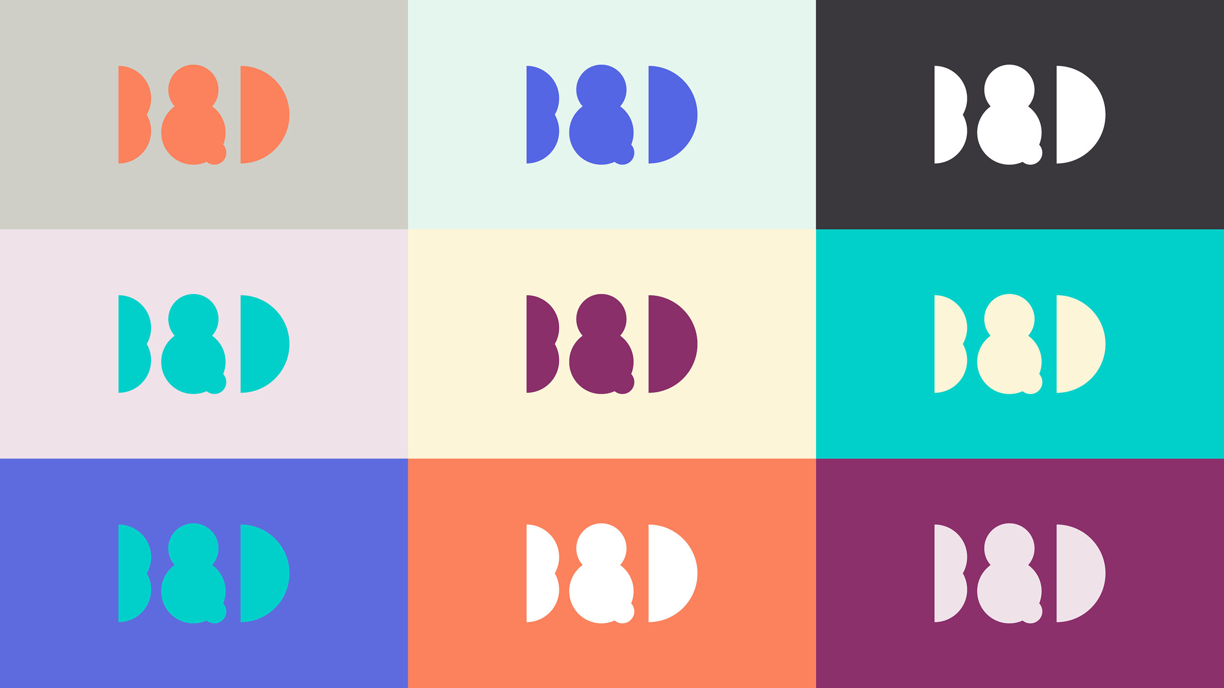
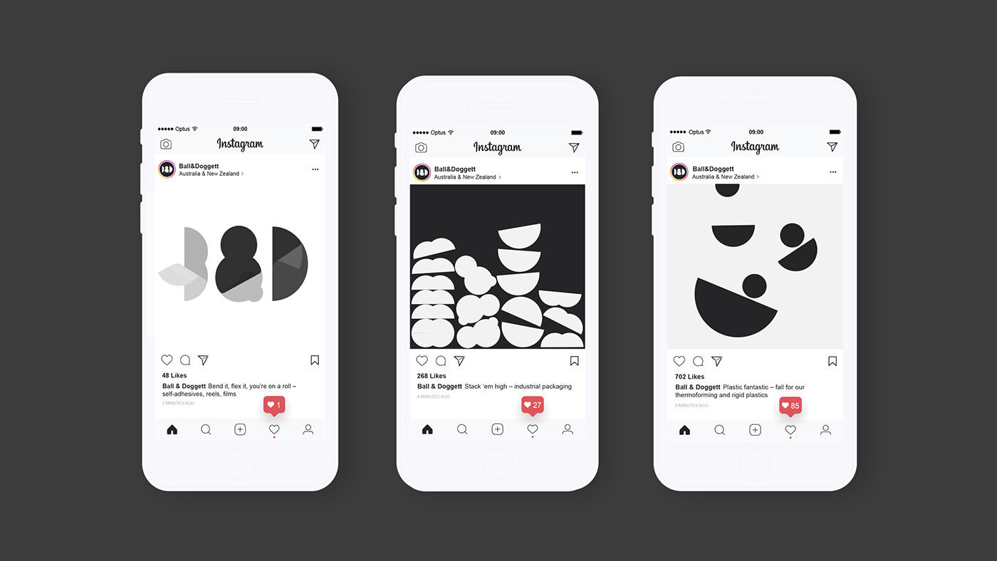
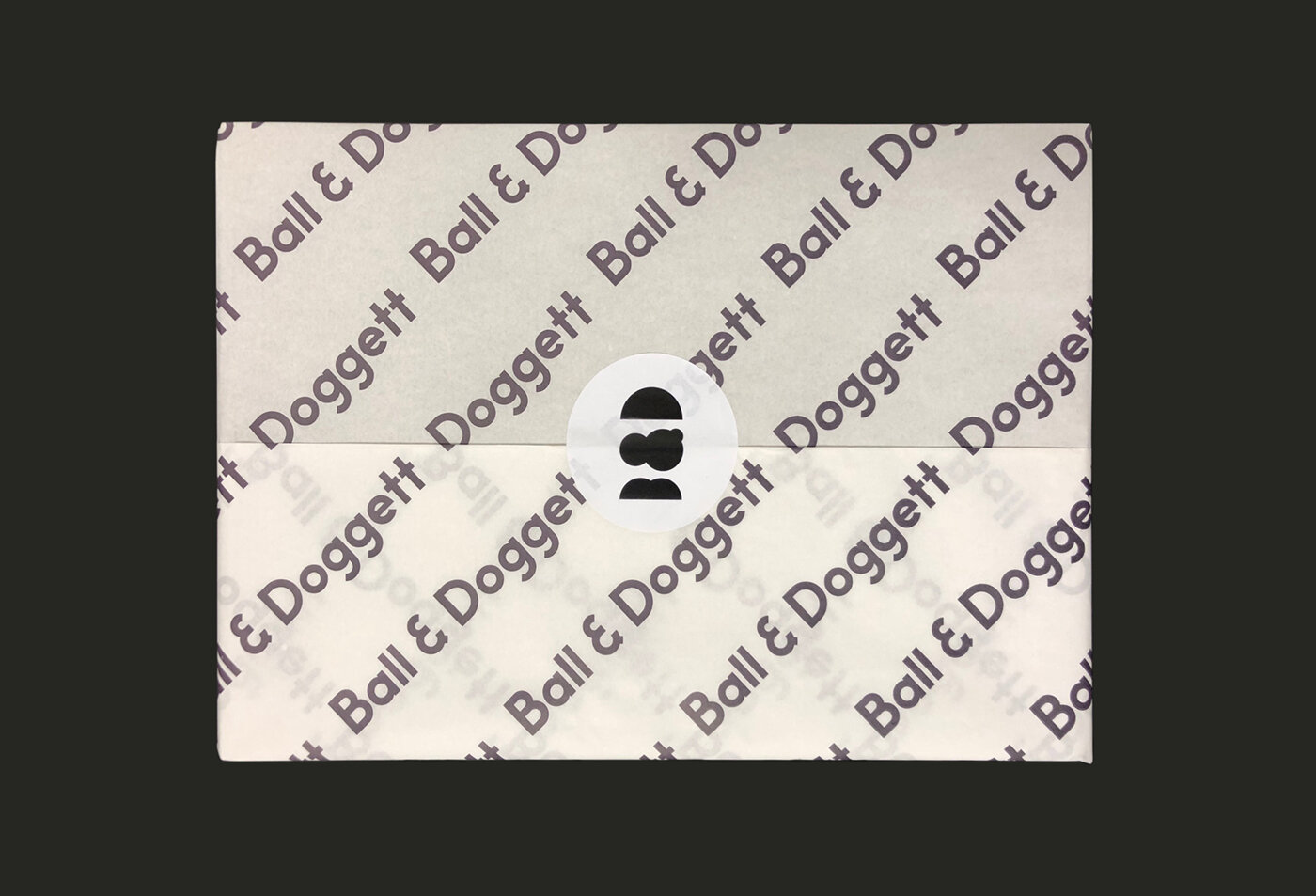
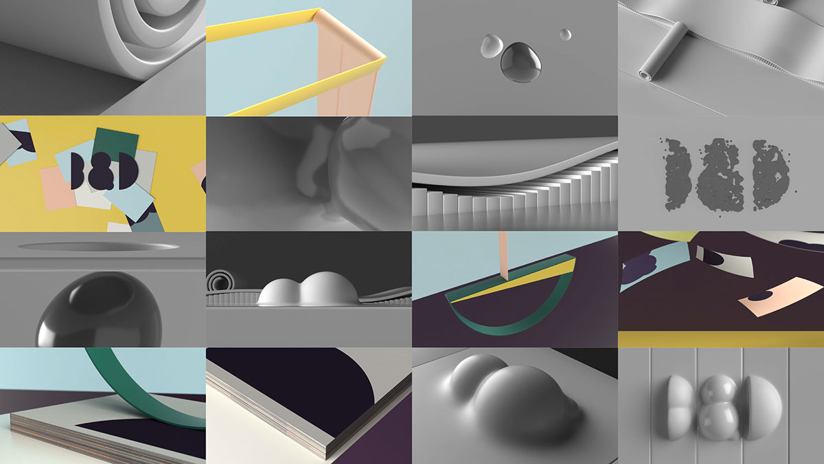
The new identity celebrates the physical nature and tactility of its product range. The simplified letterforms of the brandmark enable it to demonstrate various behaviours and material properties. Coupled with imagined weird and wonderful manufacturing processes, the identity presents the joy in all materials.
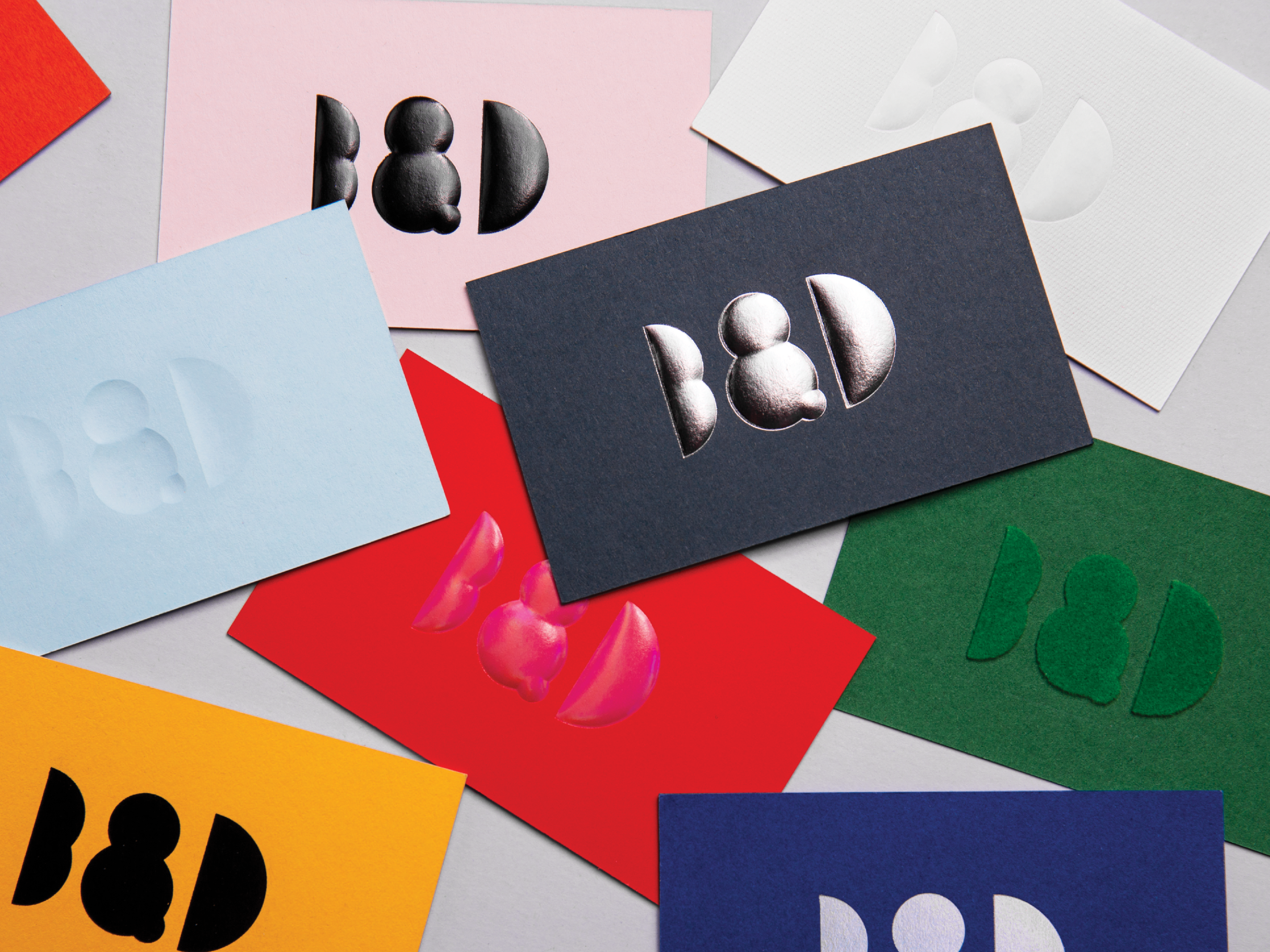
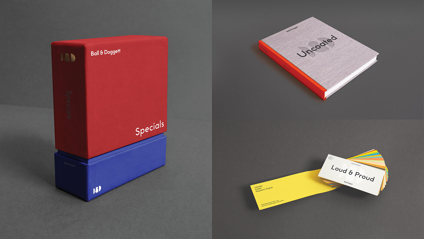
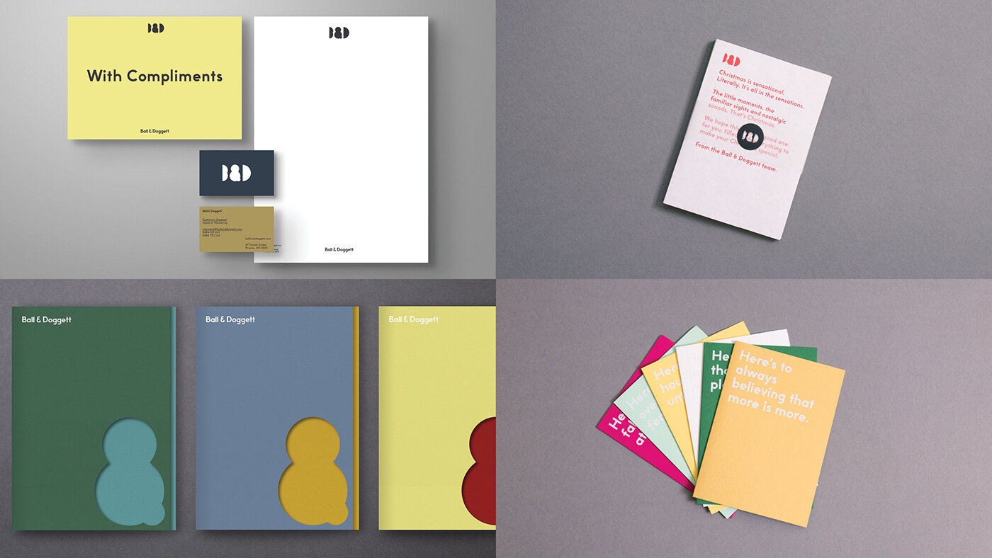
When It came to anything printed, materials are pushed to the front in applications. This meant toning down or straight up avoiding excessive graphics, and instead leaning more towards utility of information, simplified typography and a focus on making the materials do all the talking. The material is the central piece – it’s colour, texture, smell, weight etc, and every piece of design is there to support it, not distract from it.
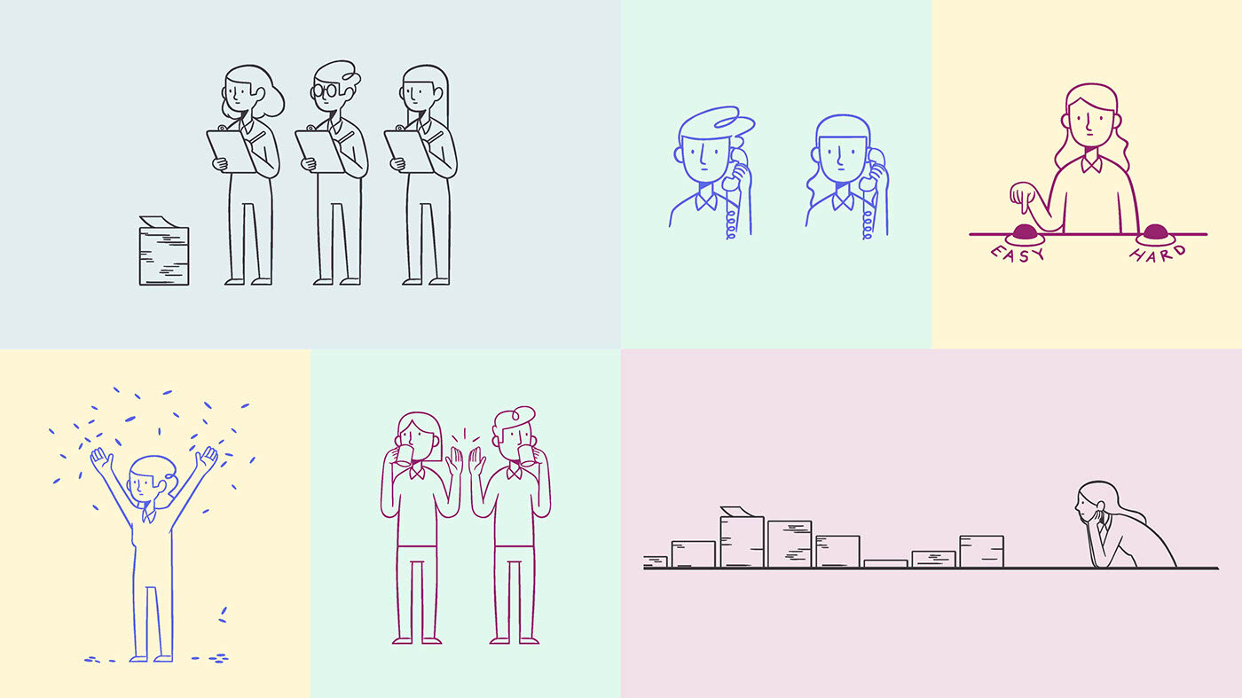
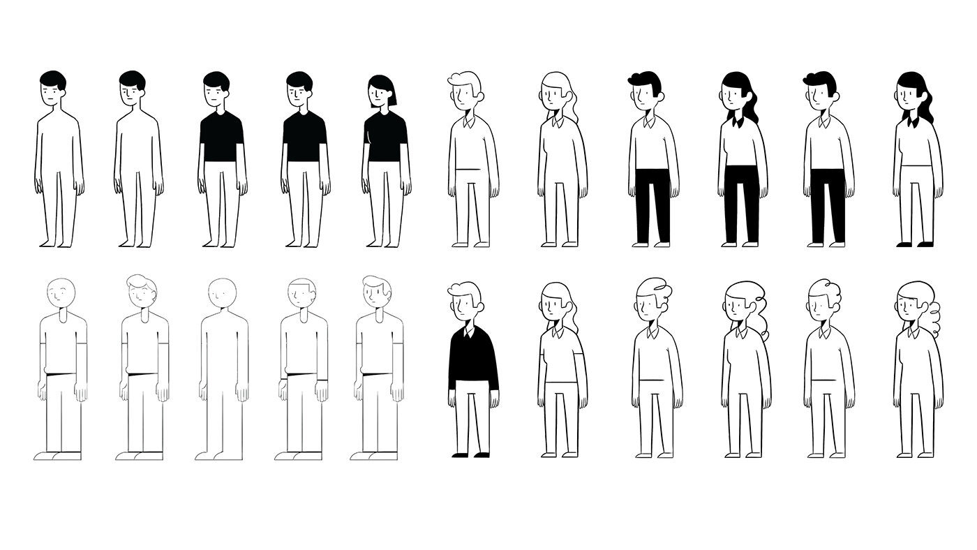
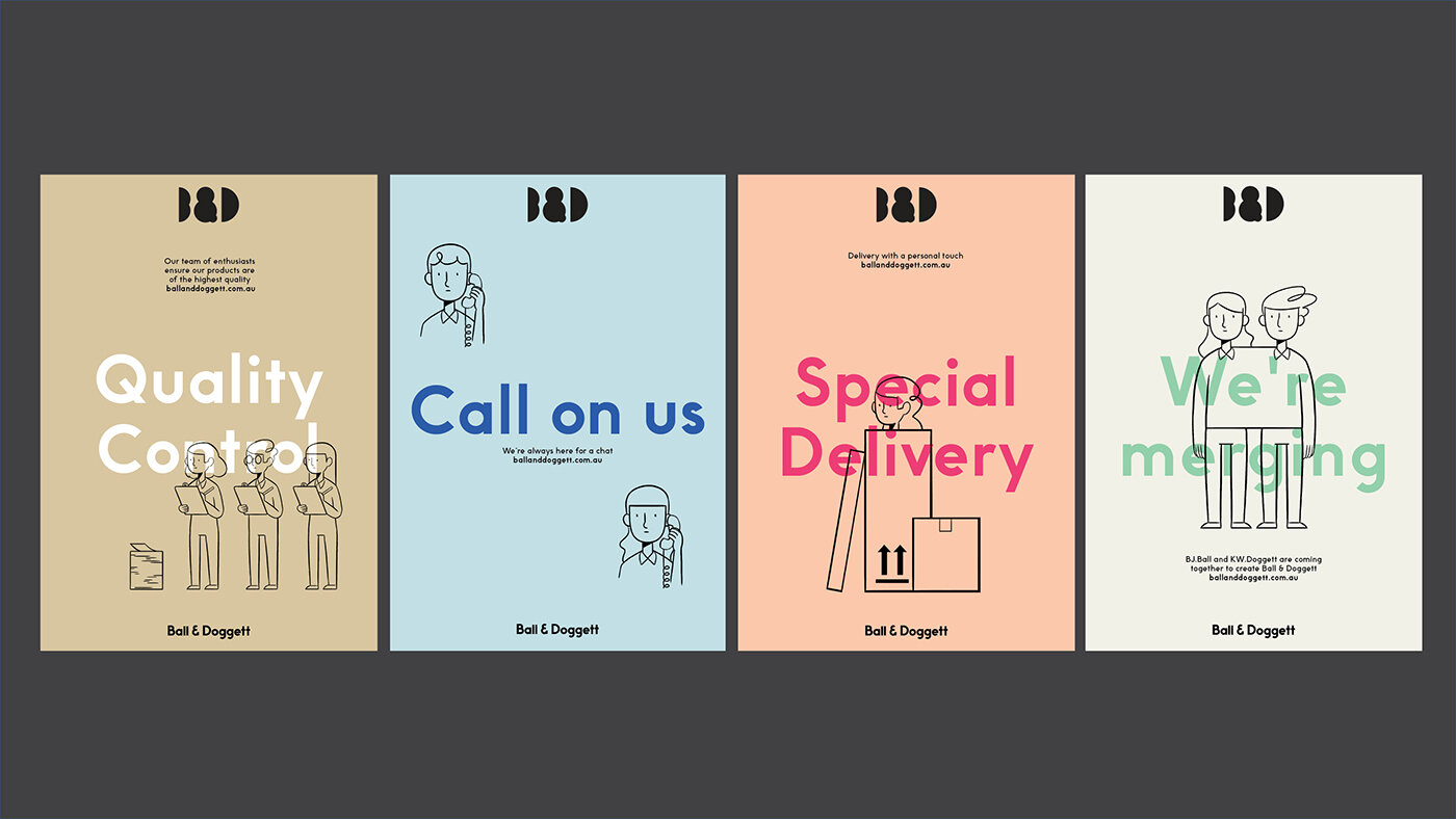
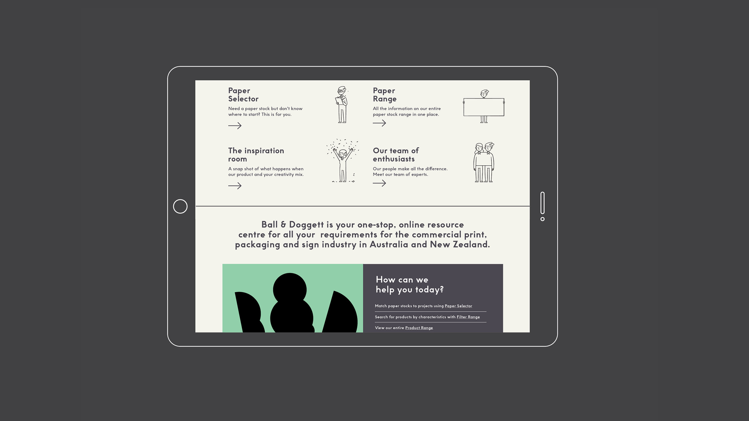
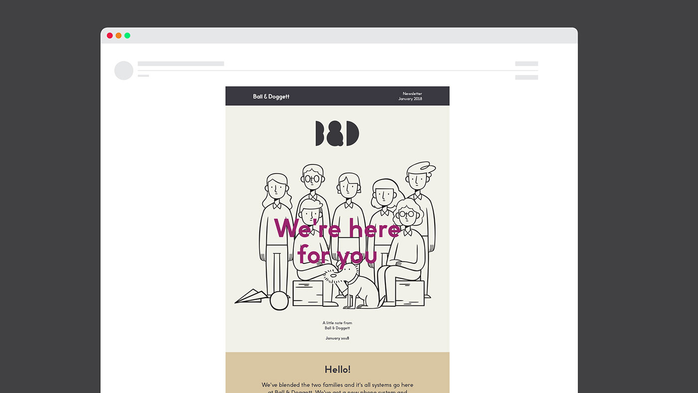
With the merging of two companies and cultures, and the need to tell a human story, we developed a series of character illustrations for to reflect the people of Ball & Doggett. These would be used for internal communications to help facilitate the merger transition.
Collaborators
Designer
— Ed Hall
Design Director
— James Gilmore
— Mel Baillache
Strategy Director
— Damian Borchok
Illustrator
— Deborah Ho
3d Illustrator & Animators
— Dominik Grejc
— Georgiy Kuznetsov
Recognition
D&AD
— Wood Pencil
AGDA
— 2x Distinction
Graphis
— 2x Gold
